


Overview
Obtaining a Temporary Restraining Order (TRO) is a confusing, multi-step process involving dense legal forms, multiple court visits and uncommon activities such as ‘serving’ the order. For many survivors of domestic abuse, this confusion just compounds an already stressful time in their lives.
AnnieCannons, a Bay Area non-profit working with survivors of human trafficking and domestic violence, requested a mobile app that alleviates this additional stress by informing survivors of the overall process and helping them complete the initial paperwork.


Preview
Key Product Features
Making A Tough Task Easier
Our research found most vendor management was scattered across numerous unreliable, off-platform methods and processes. Bringing key vendor activities onto the platform improved users’ experience and achieved the client goal of increasing transaction growth.
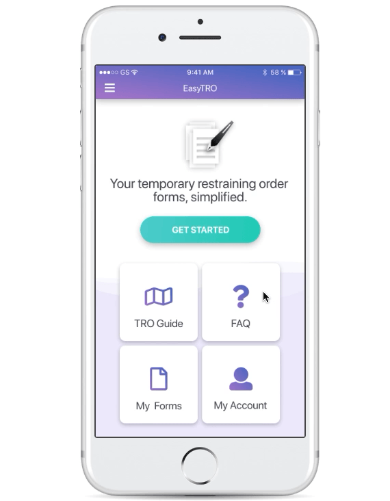
Home Screen
Eliminating Confusion With Key Resources

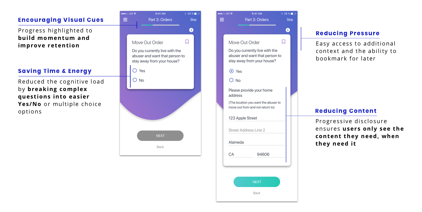
Form Design
Small Chunks, More Context = Less Stress
Navigation Bar
Ensuring Users Don’t Get Lost

TRO Forms Overview
Encouraging Users To Finish
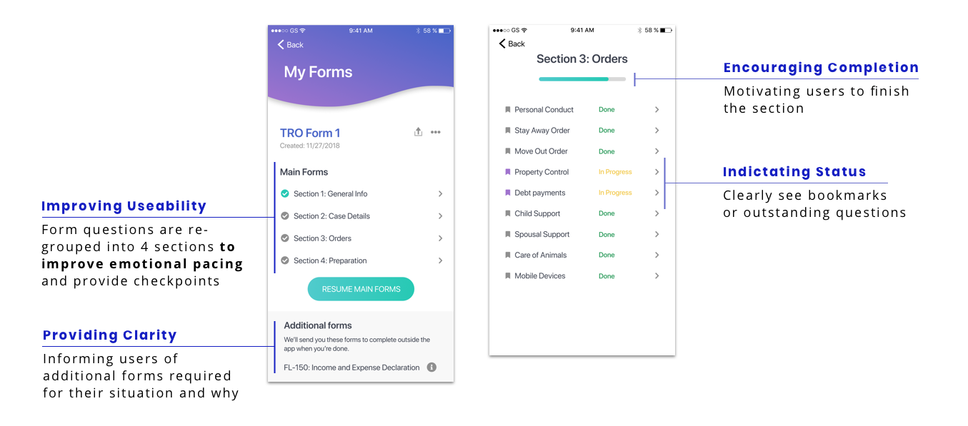
Validation
Does It Make The Process Easier?

Research
Becoming Familiar with A Complex & Sensitive Legal Process
What is a TRO & how do you obtain one? We reviewed all the forms and available online help resources to familiarize ourselves with the process.
What frustrates Survivors the most? User interviews provided insights into the areas we should focus our attention.
How can we make the TRO process less stressful? A Competitive Analysis explored ways to be empathetic to the needs of this user group.
The User Group
With the TRO application process varying by location, the client directed us to design for the survivors they work with in Alameda County. Basic characteristics include:

Are attempting to obtain a TRO for the first time
Have limited or no access to professional legal advice
Are already in a safe environment (no need to camouflage the app)
Speak English (additional languages prioritized for post-MVP updates)
User Interviews
Due to the personal and private nature of the TRO process, the client arranged for the team to meet with 6 survivors of domestic violence to better understand their experience with the TRO process. The interviews highlighted that users found the process Confusing, Time-Consuming and Overwhelming.
Key Interview Insights & Feature Requests

A Confusing Process
“What does this question even mean?”
“What other forms do I need?”
“Now what do I do?”

A Time-Consuming Task
“Took 2+ hours just to complete the form!”
Additional time was needed to find answers to general TRO questions
Redundant sections required Survivors to input info multiple times

An Overwhelming Experience
Frustration with the form worsened an already emotional process
Not knowing the implications of their responses added unnecessary stress
Poor question arrangement further contributed to a poor user experience
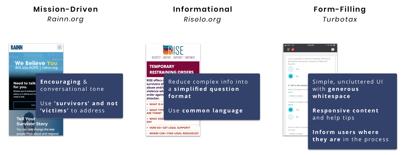
Competitive Analysis
Due to the complex and sensitive nature of the project, we reviewed 12 competitors from 3 different focus areas: mission-driven orgs, informational sites/apps, and form-filling apps.
Below are some of the key insights we found:
Design
Everything In One Place: Shorter, Simpler & Less Stressful
After presenting our findings and proposed solution for the product, we received client sign-off to move forward with the design process.
Based on our research, client engineering capabilities and client priorities we focused on three key areas to improve and streamline the process:
Key Components

TRO Guide
Explains the overall TRO process
Guides Survivors with ‘Next Steps’
Highlights unintuitive requirements

Form Design
Redesigned question format to reduce time and effort required
Clarified question copy with common language and additional information
Reordered questions to even the emotional load
Consolidated redundant inputs

Help Resources
Glossary addresses legal jargon found throughout the process
FAQ section provides more detailed answers and follow-up info
Design Focus
Improving the Form Format
By incorporating best practices from our competitive research, we updated the format to make form filling as simple and quick as possible.
Strategies such as progressive disclosure significantly reducing the amount of content Survivors had to review:

Other key form changes included:
Updating question copy from technical & bureaucratic to understandable & casual
Eliminating question ambiguity by including additional information and Tool Tips
Streamlining answers with easier inputs (multiple choice, yes/no or open field)
Design Focus
Leveling the Emotional Load Through a Better Question Flow
Speaking with Survivors confirmed our theory that the form’s question order was contributing to their overwhelming feeling.
I cut up a paper copy to explore different question arrangements and with a teammate found an order that better distributed the overall emotional load and helped create momentum.

Design Focus
Removing Confusion From The Process
Along with clarifying problematic areas within the form, we wanted to address the general confusion Survivors had with the overall TRO process. A step-by-step guide maps out the process for Survivors while other resources such as an FAQ section and Glossary are easily accessible in the app and save users time.
To avoid compounding the confusion Survivors already felt, I created a resource inventory map to justify each resource and their location in the app, ensuring they would be featured when users needed them most.

Design Focus
Broadening Scope To Achieve The Product’s Goal
While the initial client request involved only the main TRO form, DV-100, my research found other forms were also required. I reconciled these additional forms and discovered a majority of the requested info was already being gathered in our questions.
With excited client approval, we expanded the app to include these forms as well. The consolidation saved Survivors time, but also the frustration of re-entering data 4 times.
Consolidation Reduced Required User Inputs by 53%

Below is the process I used to incorporated all four forms into the app and provide data mapping guidance for the engineers.

Branding
Creating The Look, Feel, & Tone
Since EasyTRO was a new product without pre-existing visuals or direction, we worked with the client to establish the brand attributes that influenced the voice & tone, visuals and UI.


Typography & Color
Due to the text-heavy nature of the product, we prioritized legibility and familiarity when choosing our font.
The team explored various color palettes, settling on one influenced by health and wellness apps that use gradients to create a calming effect.


Final Thoughts
Lobby To Bring Engineering In Early
Designing this product proved the value of constantly getting buy-in and perspective from all stakeholders. Whether its 4am Skype calls to gain key insights directly from international users or bringing engineering into the design process to help client leadership understand their capacity.
In the future, I would lobby to include engineering earlier in the design process to help the client make more informed decisions and help focus the design effort.
Want to learn more about my process or discuss this case study? I’d love to chat! ZachDierberg@gmail.com